Full Stack UX
Situation
Our customer was an agency for mobile in-home rehabilitative therapy. The customer was noticing their therapists were texting patient information back and forth in order to conduct care. Therapists were still using paper documentation and there was an area of lost revenue when therapists couldn’t capture their billable travel time. Our team set out to create a remote, mobile offline solution that therapists could use on the road.
Problem Statement(s)
As an onsite physical therapy provider, I need to text patient information to my colleagues so that I can get information from same-day appointments with my patient because I work on the road and don’t have access to a computer between patients.
As an onsite physical therapy provider, I need to do all my notes at the end of the day so that I can do them in front of my computer at home because I am driving from one patient to the next and don’t always have time to document between patients.
Solution
After running a preliminary design thinking workshop with the development team, it was concluded that an offline mobile app, run on a tablet, would be the best possible solution within the existing constraints. The product owner for the project was able to persuade the customer that a tablet with an after-market keyboard would be the most agile tool for the users (thank goodness for great product owners!).
Design Sprint
By running a cross functional design sprint, we were able to leverage expertise from internal stakeholders, engineers, product team, and others to define the solution within a short timeframe.
Information Architecture
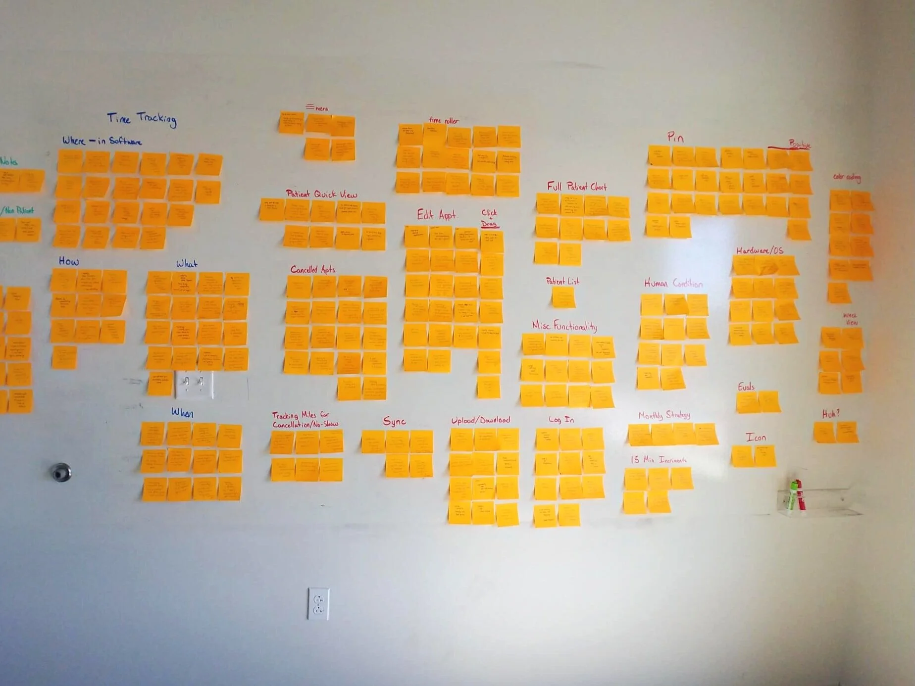
I worked closely with the product owner and the customer’s clinical director to get as close to a comprehensive list of JTBDs assembled as possible. This was what the business determined the needs of the product would be. I took those JTBDs and organized our first iteration of information architecture.
Prototyping
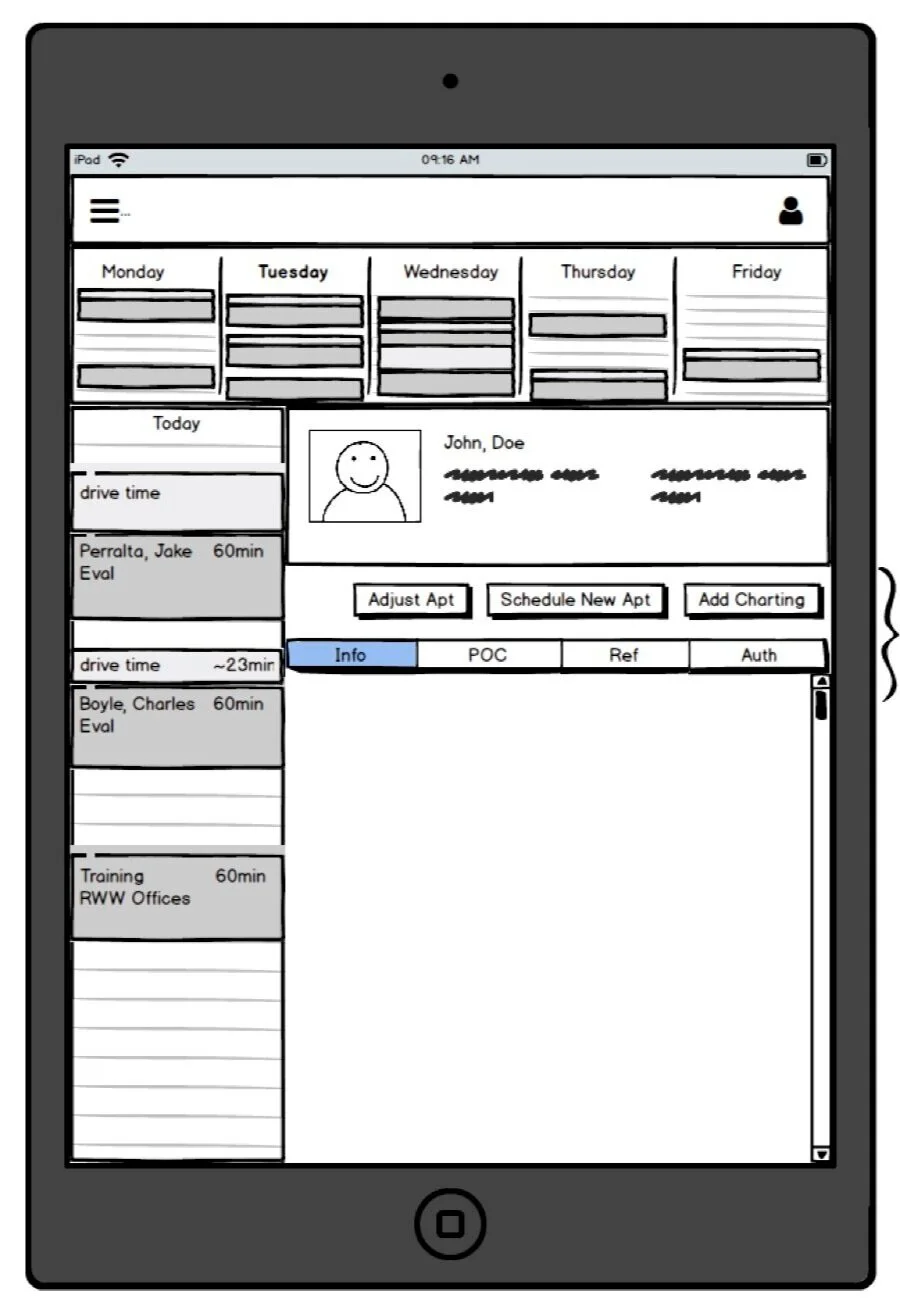
Once a few peer reviews were conducted, it was time to create low fidelity prototypes. I’m personally a huge fan of whiteboarding over paper mediums, I find it is more expedient to pivot on an idea before it gets lost in the deep recesses of one’s short-term memory. I also find it is easier to convey ideas to others when you can dynamically engage with visual representations of ideas, it leaves less space for miscommunication.
About a year prior to this project the UX team decided it was a business priority to create a company Design Language System. As a result, I was able to reduce time in the mid-fi prototype stage and quickly assemble a high-fi prototype leveraging our DLS components in figma.
Usability Testing
3 rounds of remote usability testing were conducted using the figma prototype. The following quantitative metrics were leveraged: Net Promoter Scores, System Usability Scale and Single Ease of use Questions. More importantly we were able to discover in the first round of testing that the JTBDs were valid but end users seemed to prioritize patient-related information differently than stakeholders. In round two of testing, I added a cardsorting exercise to gather what patient information was most relevant to end-users. The results of the cardsorting exercise helped me make a case to the product owner that the default setting for a patient’s file is to show the patient’s schedule before showing the patient’s note history.
Onsite Testing
Shortly after the product had gone to development we received an invitation to test this product in the newly built usability testing lab at WellSky World Headquarters. Read more about launching the lab here.


