A/B Testing A Navigation: Tabs vs. Dropdown
Premise
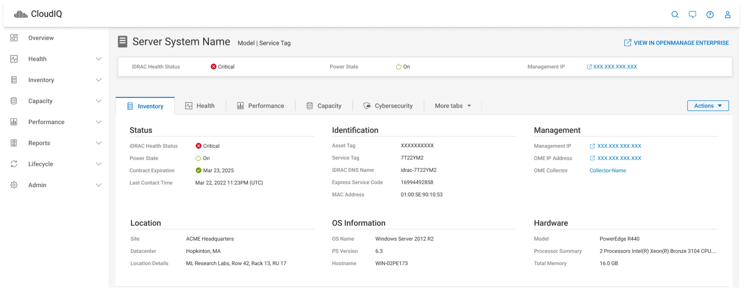
I was a part of the Design Team for Dell’s CloudIQ: a net-new Infrastructure Management Service. The UX designers on our team had not reached a consensus on which UI pattern would be the most user-centric for displaying multiple subsets of information. We found that this UI pattern fell into a grey area between what is defined as navigation and what is defined as content. We had an existing Left Navigation and therefore were debating how to display an upper navigation within the page for a further subset of information. We did not know how many items to expect in the upper navigation and we did not know what would be the most intuitive UI pattern for users.
The proposed idea was to conduct an A / B test comparing the two navigation hypotheses and collect user data to decide which pattern to move forward with.
The Tab Design (Design A)
The Dropdown Design (Design B)
Research Methods
We chose to conduct an unmoderated A/B test and survey in usertesting.com. In order to reduce bias we tested with 5 participants who would see the A first and 5 participants who would see the B first. Our 10 quality participants also answered questions out-loud in a recording, completed multiple choice questions, and participated in a card sorting activity.
Research Questions
Can the user complete tasks while using the A or B navigation UI pattern?
Is one navigation pattern more intuitive than the other?
How do the two designs compare against one another?
Findings
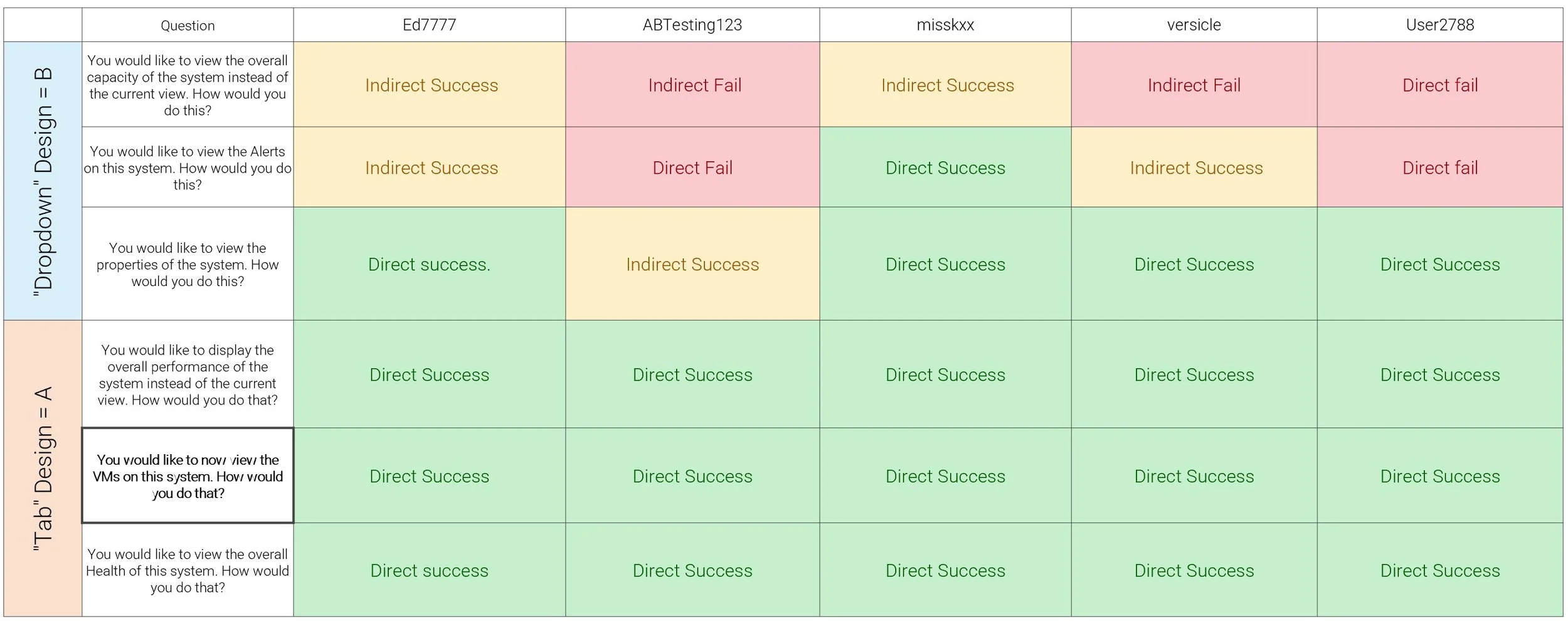
Users who saw the Tab Design first, then the Dropdown Design.
Users who saw the Dropdown Design first, then the Tab Design.
It was worth noting there was a noticeably the high fail rate in first and second tasks. Additionally, many users retroactively understood that they failed the first to tasks after succeeding at the third task.
Results of the Card Sorting Activity
Cardsort activity results in percentages
In percentages (Left) we can see at a glance that positive votes trended in favor of tabs, negative for dropdown. “Hard to use” votes send a very clear message. However, there is a third axis worth observing here that tells a different story. So lets look at this by number of votes (below).
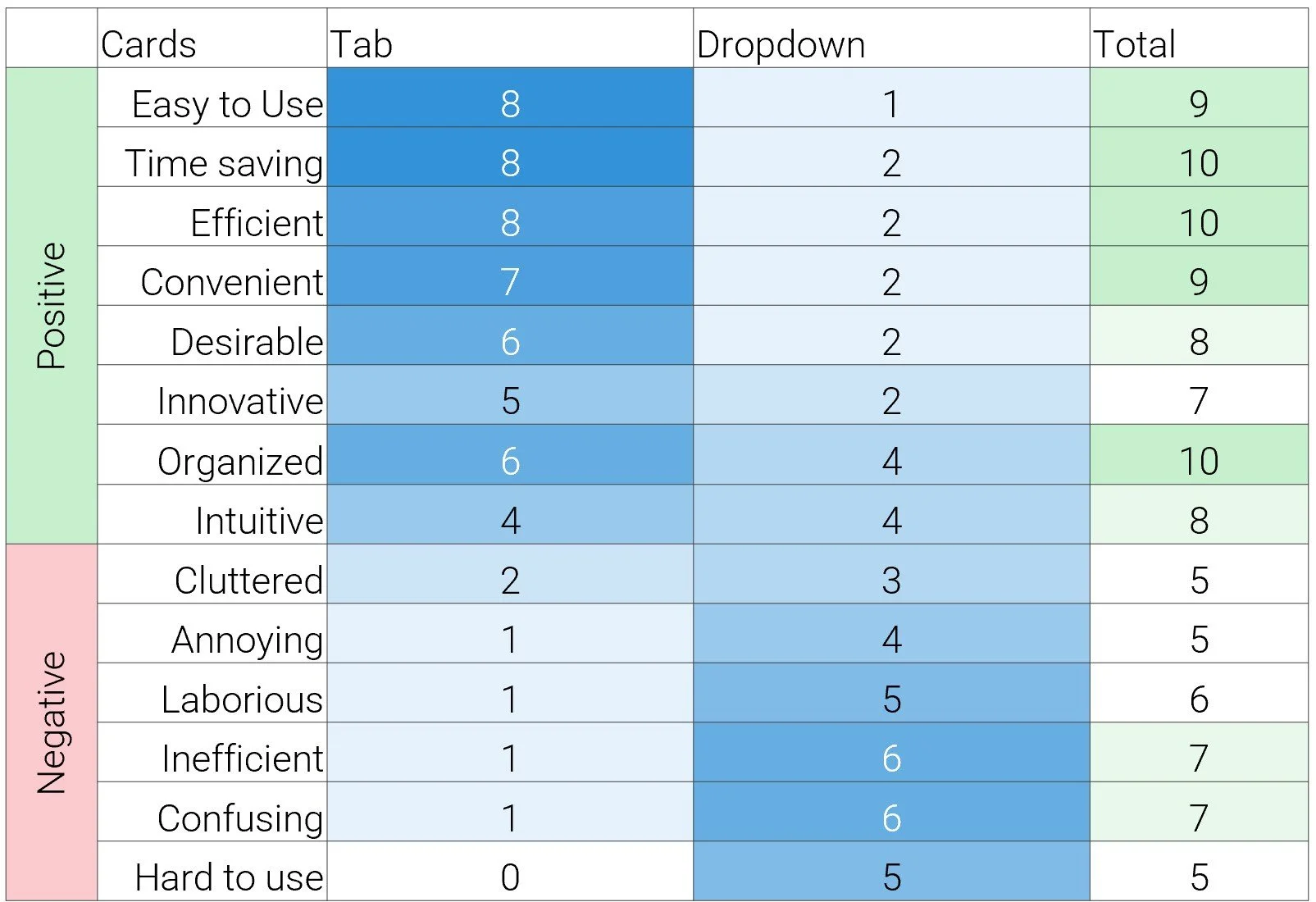
Cardsort activity results in number of votes (selections) by users.
This is now showing the number of times an item was voted for. If all ten users sorted a card then the total should be ten. But we see that there were less total sorts for the negative anecdotes – as low as half of participants chose to not sort the negative comments. This communicates a neutrality or indifference towards negative qualities.
So which is it? A or B?
At the end of the session, we asked “which would you prefer if you had to use this daily?” A or B?
2 participants selected the Dropdown Design while 8 participants selected the Tab Design.
“Tab design doesn’t list everything. Dropdown is more intuitive. I don’t think the ‘more tabs’ was necessary in the tab design…[it] left me feeling more confused… you still have to use a dropdown in the tabs design.”
“I was definitely very confused when it was a dropdown as I didn’t really realize how to click in or where to find the data, but once it was all displayed up top it made a lot more sense.”
Conclusions
At a glance, users prefer the ease-of-use Tabs design presents. But participants called out there is still a dropdown aspect in the Tabs design.
Dropdowns without context or training will result in task failures. But all users find task success by the 3rd try. Despite that, there still isn’t a spike in negative responses.
Tabs are limited to 5 items before the “more tabs” overflow.
Users vocalized feelings of neutrality towards both designs.
Users who demonstrated high scrutiny and high time on task were who voted for dropdown.
Recommendations
Use both but set strict use case parameters.
There is a business case for using the Dropdown Design. At the time the research had concluded, the Dropdown Design had already been built by the development team. Users demonstrated they can learn it, but the primary business case was that it permitted scalability for (sub) navigation scenarios with more than 5 items. However, this choice requires we put more effort into UX copy and budget more support resources for an expected initial surge in navigation issues from users.
If the business case wasn’t a constraint, my recommendation was to primarily implement the tabs design, as it enables higher delight and ease of use for users. There would be less onboarding efforts required but we would have to limit the number of tabs used and set restrictions (and incorporate restrictions into the design language system) for how many total tab items can exist in any given display.


